Paul Krugman says there’s been no surge in government spending. I say there has been. Paul offers a graph in evidence. I look at that same graph and see a four-year surge.
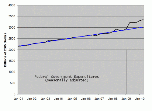
Several commenters have insisted that I am ignoring Paul’s point — the point being that if we take the Bush years as a baseline, then there’s been no surge relative to that baseline. Really? Here’s federal government expenditure from the beginning of the Bush years to today. The blue line projects a continuation of the average annual spending increases under Bush. The vertical bar marks the advent of the Obama age.

(I constructed this graph from the invaluable FRED database at the St. Louis Fed.)
Now personally, I look at this graph and the main thing I see is a ten-year surge in federal government expenditures. But if you insist on taking the Bush years as a baseline — well, then what you see, starting in 2009, is an Obama surge. You might or might not want to argue that the surge was justified (or compelled) by economic conditions, but I don’t see how you can deny it’s there.
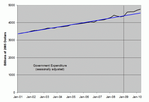
For the record, the graph looks pretty much the same (though a little less dramatic) if you total all government expenditures (not just federal):

So there.


Do these “expenditures” include tax cuts?
Touche, Professor. Touche.
Dave,
As an aside, it’s legitimate to think of true “tax expenditures” (i.e., subsidies via tax deductions/credits/exemptions), but a general change in the entire income tax level isn’t really the same thing at all, is it? That is, we have a word for “spending” and a word for “deficit” and the point of thinking of “tax expenditures” as “expenditures” isn’t to make the distinction between spending and deficit more clear, not less.
Looking at the total govt. spending curve, it looks pretty unconvincing as a surge – more of a small blip. And Krugman was very clear he was talking about total spending. Also Krugmans main point was that people had been posting graphs of spending as % of GDP to show the surge. He pointed out that it was GDP going down rather than spending going up that caused the increase.
The key here is the period selected for display. Krugman chose 2006. It looks as if this is the start of a slightly steeper slope. From 2006 there does not seem to have been an increase in the slope.
The start and end points must be chosen for proper reasons. There was an example recently of people who disbelieve global warming showing graphs of global temperature from 1998 onwards. That date was only selected because that was a very hot year, so the slope from then to 2009 was flat, or possibly a bit down. This led to headlines “Global Temperature Falling”, and seeems to have taken in Dubner and Levitt of Freakonomics fame. (who should know better).
Steve has chosen all of the Bush years, a justifiable start point. So why has Paul chosen 2006? He says on his page that people have been posting charts “like this”, and shows a graph starting in 2006. If he has chosen the same start date as his critics, then I think he is in the clear. If he has chosen 2006 because this is the date that makes the Obama increases look the least, then perhaps you have a point. He may also have chosen 2006 for some other valid reason, perhaps that 10 years is too far back to go.
Another noteworthy feature of your graphs is that they all have 0 at the bottom so that a 25% surge looks exactly like a 25% surge. With Krugman’s, spending goes from 30% to 37% and from $0 to $6000 billion. The second graph is practically flat compared to that very pointy first graph.
I also notice that the surge is only the thickness of two Krugman-lines. I, mean, how could two lines of thickness possibly count as a surge? It’s amazing how different the data looks drawn with a $50-billion wide pen, as compared to a $20-billion wide pen.
Steve, you claim that “the blue line projects a continuation of the average growth rate under Bush.” This is not correct. The blue line adds a constant value over time, hence it is linear. If you had a constant growth rate, then you would not have a linear relationship over time. What you are projecting with the blue line is a declining growth rate.
Robert: You are right. I should have said a continuation of the average annual increases under Bush. I am editing to fix this.
Assuming the data is accurate, this is the least contentious post is months.
In response to Roberts point, would it not be more appropriate to fit a line continuing the average growth rate? This would curve up gently, and reduce the apparent surge.
I think krugman is justified in his point – the increase in total govt. spending does not qualify as a surge to him. After all, there is no strict definition of a surge. You can therefore look at the same data and say there is a surge.
By he way, which bit of FRED did you take the data from? – there is rather a lot there.
A few points, based just on Krugman’s graphs.
Harold writes: “Steve has chosen all of the Bush years, a justifiable start point. So why has Paul chosen 2006? He says on his page that people have been posting charts ‘like this’, and shows a graph starting in 2006. If he has chosen the same start date as his critics, then I think he is in the clear.”
No, then he’s the LEAST in the clear. If he’s talking about an increase over the entire 4-year period, then:
– He’s saying that the only reason why the slope in graph A (spending/GDP) is steeper than that in graph B (spending) is the division by the GDP, which is supposedly misleading because “GDP growth has plunged.” Yes, the GROWTH has; but the GDP itself, despite the few months of decline, has increased over the past 4 years. That’s a basic function-vs-derivative thing.
– Thus, despite his condescending title — “Special Bulletin: Fractions Have Denominators” — he’s the one getting the impact of the denominator exactly backwards: the denominator has increased, so the slope of the function in graph B should actually be greater than that of the function in graph A (which one can furthermore verify by hand: the respective increases are about 27% vs. 17%, from ’06 to ’10). That’s an even worse error than the previous one.
If he’s instead talking about (a lack of) an increase under Obama as compared to under Bush, then:
– Draw straight lines between the points corresponding to ’08, ’09, and ’10 in each graph: in the first, the union of the two lines is slightly concave down; in the second, it’s concave up. This means that the GDP growth (including, perhaps, inflation) was higher in ’09-10 than in the preceding year (or for that matter than in the 3 preceding ones, on average). So either his graph is numerically wrong, or he still got the denominator thing backwards, or his implication that the GDP growth plunge is affecting Obama’s numbers more is garbage. (He does talk about two years vs two years, and for that case the concavity is indeed greater in the first graph — but then, it’s no longer about Obama alone, but about Bush/Obama with a Democratic Congress).
(BTW, most people I know who care about spending don’t single out Obama; they’re also upset at Congressional Democrats, and at Bush, and at the GOP Congress he had until ’07. So the claim about “the narrative you hear everywhere” is kinda disingenuous to begin with.)
… Therefore, either way, he doesn’t get the result he wants. So what does he resort to? Rescaling one graph and not the other — such a blatant attempt to mislead that I wouldn’t have thought anyone would bother with it, since that trick is so simple and therefore so well-known. But, apparently (or so he must think), not to NYT readers.
Amazing, isn’t it, that we follow our discussion on what it means to be rational with a debate about whether or not the plots shown above exhibit “a sudden large increase that happens during an otherwise stable or quiescent period”, or, more simply put, “a surge”.
The fact that we are debating this demonstrates to me that Paul Krugman’s influence has far exceeded his ability to lead honest and sensible discussions about economic policy.
I would have to agree with Dave. The Bush tax cut need to be factored in. The the graph seems to show stimulus bill as the cause of the surge at the beginning of the Obama presidency with the rest of the Obama line being the same slope as Bush’s. The stimulous was meant to inject money into the economy which served the same purpose as Bush’s tax cuts. Its very dishonest to say an increase in spending is important to look at but a decrease in money being brought in can be ignored.
Dave: “Do these ‘expenditures’ include tax cuts?” I’m not sure if you meant it the following way, but if you did, kudos.
Krugman (as properly IMHO criticized by SL previously) equates taxes and spending: cutting $1 from spending is the same as increasing taxes by $1. Therefore, to be fair, Krugman should graph expenditures increased by tax cuts (making the surge—yes, Harold I see a surge–larger).
The Web blog Econbrowser.com (run by James Hamilton and Menzie Chinn) has an entry that gives some different views than Steve’s.
It is an entry by Menzie Chinn. He says at the end:
“So, it is true that the Federal government’s role in terms of spending and transfers has increased against the backdrop of a massive decline in output starting in 2008Q4 — but some of the movements in various indicators are distorted by the large negative output gap that has opened up.
Paul Krugman has a related observation.”
Weblink is:
http://www.econbrowser.com/archives/2010/10/the_everexpandi_1.html
“The fact that we are debating this demonstrates to me that Paul Krugman’s influence has far exceeded his ability to lead honest and sensible discussions about economic policy.” -Thomas Bayes
I wish this forum had a like button. I liked that.
I remember coming to a similar conclusion after reading one of Krugman’s columns for the first time years ago. I decided he wasn’t worth my time because I simply couldn’t trust that he would present an fair and honest case.
Over the years it has befuddled me how much attention he gets.
(I may have misread Harold’s post; sorry, it was pretty late at night. But my points stand: under either interpretation — whether Krugman means that spending hasn’t increased all that much, or that it hasn’t increased any faster under Obama — he is completely wrong, even if we rely solely on the graphs he himself provides.)
The trouble with this discussion is that there is no defined terms. Krugman says there has been an increase in Govt. spending (NOT federal spending), but it was too small and in the wrong place to act as sufficient stimulus. Steve is saying there was an increase in government spending, less dramatic than federal spending. There is not necessarily any contradiction between these two views. If there is, it needs to focus on how big Krugman thinks the increase needed to be.
It’s worth noting that Krugman posted more on this topic today. The link to the Menzie Chinn piece is worthwhile reading too:
http://krugman.blogs.nytimes.com/2010/10/15/big-spender-update/
“That uptick in transfers at the end is mainly unemployment insurance, plus some Medicaid — that is, it’s safety-net spending in the face of high unemployment.”
shouldn’t you fit a strait line to all the data
and get a p-value for that,
then fit a bush strait line + obama surge then get a p-value for
that and see which one is a better fit?
i would guess neither is a dominant answer and this whole argument
is pointless.
Why don’t we just admit that Bush II was pursuing fiscal and monetary stimulus, and Obama is just doing more.
Fiscal stimulus under Bush didn’t work, why would it work now?